Jeff Duntemann's Contrapositive Diary Rotating Header Image

css

Scarcity Leaves Its Mark

Whether or not an unexamined life is worth living, examining what goes on inside your head is a lot of fun. I’ve become interested in psychology late in life (after treating it with contempt when I was a cocksure young rationalist) and identifying my biases and tracing them back down to their sources has become a minor hobby here.

My recent study of CSS reminded me of one of those biases: I hate windowing. I just hate it, and hate it so deeply I don’t even notice the hatred anymore. If you were to look over my shoulder as I work, you’d notice that I don’t use it. Whatever app I’m working in gets the whole screen, and when you can see the desktop at all, it means I’m in neutral and nothing useful is going on. I came to the insight after practicing fluid layouts in CSS. BTW, If you’re interested in learning how to do fluid layouts, I haven’t found anything better than Nate Koechly’s Web article “Intricate Fluid Layouts in Three Easy Steps.” Nate created the Yahoo UI Grids CSS system, which I may begin using once I learn enough CSS by building things from scratch. I like YUI because it supports fixed widths. Fluid layouts are not mandatory.

This is good, as I find fluid layouts peculiarly repellant. Things like this suggest a live frog nailed to a tree, squirming in agony. (Drag the corner of the window around and you may start to see what I mean.) Part of it is my long history with fixed page layouts in magazine and book work, and part of it is a desire to focus and not be distracted by things going on in other windows. The bulk of the bias, I think, proceeds from the same reason that the Greatest Generation were tireless savers and hated to waste anything: They grew up in conditions of scarcity. I ducked the Great Depression and WWII, but I followed personal computing from its rank beginnings, when displays were 16 X 64 character text screens or worse. I learned computers starving for screen real estate.
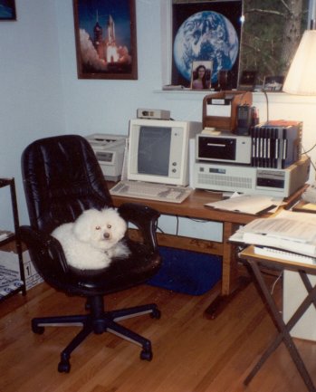
The IBM PC gave us 24 X 80 displays, but that was never enough. Text windowing systems like TopView seemed insane to me, and back in April 1989, when I was doing the “Structured Programming” column in DDJ, I wrote and published an “anti-windowing system” that treated the crippled 24 X 80 display as a scrollable window into a much larger character grid. Full-page text displays eventually arrived: The MDS Genius 80-character X 66-line monochrome portrait-mode text display (left) sat on my desk from 1985 through 1992, when Windows 3.1 finally made text screens irrelevant. (Lack of Windows drivers for the display soon forced MDS into liquidation.) It wasn’t until I bought a 21″ Samsung 213T display in 2005 and started running at 1600 X 1200 that I first recall thinking, “Maybe this is big enough.”

And only just barely. People who were born with a 1024 X 768 raster in their mouths may not be able to figure it, and I guess there’s really no way I can explain. It’s just me. Starve a man for screen space for thirty years, and he is unlikely to want to share what he has with more than one app at a time. Scarcity leaves its mark.

CSS Progress

I'm continuing my re-exploration of CSS in my spare moments, and it's worked out very well so far. If you're doing static pages that don't need Javascript or other fancy stuff, CSS can make very slick layouts with only a handful of rules. The problem of many people using old browsers that don't fully support CSS still exists (especially for IE) but to some extent it always will. CSS-challlenged IE6 still has 32% of the browser market, which means that at least 32% of people will not see your pages render correctly, and that seems like an awful lot to me. I thought I was alone in grumbling about this, but I'm not—and this guy does webstuff for a living.

Anyway. The browsers aren't there yet, but they do enough to support my modest goals. First of these is to get rid of table-based layouts in my Web articles. Tables are a kluge, but they were the best that the Web could do for its first ten years. Another goal is to create an “imprint style” defined in a single external style sheet. I've taken my several articles about kites and have been CSS-izing them to a common imprint style. These three articles work off the same style sheet:

(The Hi-Flier article is the biggest and messiest, and is still on the workbench.) The headers are custom-made images for the sake of the decorative title fonts. One of the Web's biggest defects is not having embeddable fonts. If you want to use fancy fonts, you have to render the font text in graphics and treat the rendered titles as images. I don't mind doing that at all; the page title is present in the META information, so the Semantic Web, wherever the hell it's hiding, will not be deprived of its due.

I'm still interviewing CSS editors. I've already gone through a bunch of them. The biggest disappointment was Amaya, an editor/validator that goes way back and was created by the W3C. Something that old (it's been around since 1996!) should be much better by now. Six of the toolbar icons are empty holes, and it crashes with the same unenlightening error on Win2K that Kompozer does. It did help me clean up my markup between crashes, but there are other ways to do that. Another major disappointment was TopStyle, an $80 commercial product with a downloadable trial version. The trial version is a good thing, because the only supported preview browser is IE. You can rig it to preview with Firefox, but there's a three-year-old message claiming that the Mozilla embedding technology is “experimental” and not supported, with warnings that border on those against crossing the streams. No way to preview in Opera or anything else. This is the kind of lazy-ass nonsense I will sometimes forgive on free products, but it's most of the way to 2009, and anything that costs money and claims a preview feature had better do IE, Firefox, and Opera, or it gets the hook. TopStyle got the hook.

In the meantime, I'm using Kompozer every day downstairs on my XP machine, and it hasn't crashed yet. It's got some thin spots—by default it creates internal style sheets, and you have to manually insert a link to an external sheet—but now that I've gotten to know it, my productivity is way up. Kompozer is a cleaned-up version of Nvu, and the French chap who wrote Nvu is working on a successor. (Having a little French helps here, though most of his posts are at least mostly in English.) Kompozer/Nvu's heart is definitely in the right place, and if I have to use it for awhile until M. Glazman releases its successor, I should at least be able to get some work done.

Other odds and ends associated with my efforts to transcend Webfossilhood:

  • I tried to upload WordPress to Sectorlink using a product called ZipDeploy. Apart from the arrogance of having a three hour trial period (!!!) the damned thing got partway through the longish upload and…vanished. It didn't show an error dialog. It didn't even beep. The app window simply disappeared, leaving the upload incomplete. There was nothing running in Task manager. It Died And Made No Sign. Hook!
  • Sectorlink being unhelpful in this regard (and I will not be renewing the contract for next year there) I went over to my Fused Network account and installed WordPress through their Installatron utility. It took 2 minutes and worked flawlessly. I've had difficulty installing Gallery 2 there, but it's looking like the problem is with Gallery and not Installatron.
  • Contra will be moving to WordPress sometime around the first of the year, depending on how quickly I learn it and how long it takes to sort out the hosting equation. There is a plug-in to do automatic cross-posts to LiveJournal, so I will be keeping my LiveJournal mirror. But this hand-edited table monster will (finally) be laid to rest. My WordPress install is browsable, but don't bookmark it, and don't expect it to be a mirror. It's just test posts. I have it on junkbox.com right now, but it will be on duntemann.com when it “goes live.”

And so to work.

On Being a Webfossil

Carol and I bundled up the puppies and took Otto (our Bigfoot RV) down the road about 100 miles to Buena Vista, Colorado, and we’re kicking back here amidst the mountains for a few days. We’re not doing much—that’s the idea!—but reading and gathering our thoughts.

I’ve been tearing at what I call my “Webfossil” problem for some time now without saying much about it here. I’ve been posting content to the Web since 1995, and way back then I tried all kinds of things. However, for the past seven or eight years I’ve been using basically the same toolset: Dreamweaver 3/Fireworks 3. These were released in 1999 and are pretty creaky, but they work and the content gets posted. Periodically people message me and tell me that my HTML is a little bizarre, and it is, because I don’t write it—that’s what software is for. (Newcomers here should keep in mind that I’m the Visual Developer Magazine guy, and that WYSIWYG design, whether for code or for content, is one of my major fetishes.) I’ve become a bit of a Webfossil. Yes, I know, I need new software.

But if I’m considering new software, shouldn’t I be thinking about entirely new approaches to the basic challenge? I keep a blog, and I write Web articles on various topics, both using 1999-era tools. LiveJournal has been a useful mirror, and I adopted it almost entirely to provide an RSS feed for Contra. (The comments have been fun, and were something of a surprise.) I don’t really need LiveJournal for that anymore, as hosting services with preinstalled and house-supported instances of blogging tools like WordPress are common and cheap. (I just got an account with one and am testing a few things. More on this in coming weeks.)

CMS packages are one alternative approach that I’m looking at very closely. Blogging is either built-in or supported by plug-ins, and management of static articles is basically what CMS systems are for. It’s an embarrassment of riches out there; my biggest question now is which one to choose. Drupal is more secure than Joomla, but from what I’ve seen it takes a lot of work to change anything, most of which is hand-coded PHP or CSS. Now I’m no expert at either, but I’ve played with both and I’m a quick study when I know it’s worth my while. What I barf on is what I always barf on: Too much work per unit result. Hand-coding is fun (and addictive—definitely been there!) but it wastes my time, and at 56, you reluctantly start counting the years you have left.

I know less about Joomla, but it looks like it has more visual tools, more plug-ins, and more available themes. The themes are CSS and thus easily altered by a very cool sort of object-oriented programming for content markup. CSS is fun, if you don’t get deranged about seventeen-box fluid layouts. I tried it back in 2001 or so, and set it aside because the spec was twenty miles ahead of the rendering engines. There are still some weird little issues—the CSS greasy eminences do not like the HR tag at all, and deprecate it mortally in favor of peabrained hacks like making the lower edge of a paragraph box visible—but b’gosh and begorrah, you can render the same code in the major browsers these days and it all looks pretty much the same. I guess I really should abandon table-based layouts.

My fundamental objection to CSS remains: There’s no reason not to drag text boxes around on a display and then have the software compile your design to XHTML and style sheets—except the software to do this doesn’t exist yet. I still have a couple of things to test, primarily Style Master and especially iStylr, but even the formidable Dreamweaver CS3 is still basically an HTML table-basher. I’ve been doing that for seven years now and it’s a nuisance.

I may hand-code a fluid equivalent to my canonical table-based Contra layout for practice if nothing more, but the ultimate solution is probably an all-purpose turn-the-crank Web content management system, even if what I want doesn’t quite exist yet. Sooner or later, it will. Time to crack the mold (as venerable and useful as it’s been) and stop being a fossil.