Jeff Duntemann's Contrapositive Diary Rotating Header Image

software

Scarcity Leaves Its Mark

Whether or not an unexamined life is worth living, examining what goes on inside your head is a lot of fun. I’ve become interested in psychology late in life (after treating it with contempt when I was a cocksure young rationalist) and identifying my biases and tracing them back down to their sources has become a minor hobby here.

My recent study of CSS reminded me of one of those biases: I hate windowing. I just hate it, and hate it so deeply I don’t even notice the hatred anymore. If you were to look over my shoulder as I work, you’d notice that I don’t use it. Whatever app I’m working in gets the whole screen, and when you can see the desktop at all, it means I’m in neutral and nothing useful is going on. I came to the insight after practicing fluid layouts in CSS. BTW, If you’re interested in learning how to do fluid layouts, I haven’t found anything better than Nate Koechly’s Web article “Intricate Fluid Layouts in Three Easy Steps.” Nate created the Yahoo UI Grids CSS system, which I may begin using once I learn enough CSS by building things from scratch. I like YUI because it supports fixed widths. Fluid layouts are not mandatory.

This is good, as I find fluid layouts peculiarly repellant. Things like this suggest a live frog nailed to a tree, squirming in agony. (Drag the corner of the window around and you may start to see what I mean.) Part of it is my long history with fixed page layouts in magazine and book work, and part of it is a desire to focus and not be distracted by things going on in other windows. The bulk of the bias, I think, proceeds from the same reason that the Greatest Generation were tireless savers and hated to waste anything: They grew up in conditions of scarcity. I ducked the Great Depression and WWII, but I followed personal computing from its rank beginnings, when displays were 16 X 64 character text screens or worse. I learned computers starving for screen real estate.

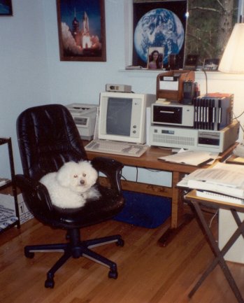
The IBM PC gave us 24 X 80 displays, but that was never enough. Text windowing systems like TopView seemed insane to me, and back in April 1989, when I was doing the “Structured Programming” column in DDJ, I wrote and published an “anti-windowing system” that treated the crippled 24 X 80 display as a scrollable window into a much larger character grid. Full-page text displays eventually arrived: The MDS Genius 80-character X 66-line monochrome portrait-mode text display (left) sat on my desk from 1985 through 1992, when Windows 3.1 finally made text screens irrelevant. (Lack of Windows drivers for the display soon forced MDS into liquidation.) It wasn’t until I bought a 21″ Samsung 213T display in 2005 and started running at 1600 X 1200 that I first recall thinking, “Maybe this is big enough.”

And only just barely. People who were born with a 1024 X 768 raster in their mouths may not be able to figure it, and I guess there’s really no way I can explain. It’s just me. Starve a man for screen space for thirty years, and he is unlikely to want to share what he has with more than one app at a time. Scarcity leaves its mark.

CSS Progress

I'm continuing my re-exploration of CSS in my spare moments, and it's worked out very well so far. If you're doing static pages that don't need Javascript or other fancy stuff, CSS can make very slick layouts with only a handful of rules. The problem of many people using old browsers that don't fully support CSS still exists (especially for IE) but to some extent it always will. CSS-challlenged IE6 still has 32% of the browser market, which means that at least 32% of people will not see your pages render correctly, and that seems like an awful lot to me. I thought I was alone in grumbling about this, but I'm not—and this guy does webstuff for a living.

Anyway. The browsers aren't there yet, but they do enough to support my modest goals. First of these is to get rid of table-based layouts in my Web articles. Tables are a kluge, but they were the best that the Web could do for its first ten years. Another goal is to create an “imprint style” defined in a single external style sheet. I've taken my several articles about kites and have been CSS-izing them to a common imprint style. These three articles work off the same style sheet:

(The Hi-Flier article is the biggest and messiest, and is still on the workbench.) The headers are custom-made images for the sake of the decorative title fonts. One of the Web's biggest defects is not having embeddable fonts. If you want to use fancy fonts, you have to render the font text in graphics and treat the rendered titles as images. I don't mind doing that at all; the page title is present in the META information, so the Semantic Web, wherever the hell it's hiding, will not be deprived of its due.

I'm still interviewing CSS editors. I've already gone through a bunch of them. The biggest disappointment was Amaya, an editor/validator that goes way back and was created by the W3C. Something that old (it's been around since 1996!) should be much better by now. Six of the toolbar icons are empty holes, and it crashes with the same unenlightening error on Win2K that Kompozer does. It did help me clean up my markup between crashes, but there are other ways to do that. Another major disappointment was TopStyle, an $80 commercial product with a downloadable trial version. The trial version is a good thing, because the only supported preview browser is IE. You can rig it to preview with Firefox, but there's a three-year-old message claiming that the Mozilla embedding technology is “experimental” and not supported, with warnings that border on those against crossing the streams. No way to preview in Opera or anything else. This is the kind of lazy-ass nonsense I will sometimes forgive on free products, but it's most of the way to 2009, and anything that costs money and claims a preview feature had better do IE, Firefox, and Opera, or it gets the hook. TopStyle got the hook.

In the meantime, I'm using Kompozer every day downstairs on my XP machine, and it hasn't crashed yet. It's got some thin spots—by default it creates internal style sheets, and you have to manually insert a link to an external sheet—but now that I've gotten to know it, my productivity is way up. Kompozer is a cleaned-up version of Nvu, and the French chap who wrote Nvu is working on a successor. (Having a little French helps here, though most of his posts are at least mostly in English.) Kompozer/Nvu's heart is definitely in the right place, and if I have to use it for awhile until M. Glazman releases its successor, I should at least be able to get some work done.

Other odds and ends associated with my efforts to transcend Webfossilhood:

  • I tried to upload WordPress to Sectorlink using a product called ZipDeploy. Apart from the arrogance of having a three hour trial period (!!!) the damned thing got partway through the longish upload and…vanished. It didn't show an error dialog. It didn't even beep. The app window simply disappeared, leaving the upload incomplete. There was nothing running in Task manager. It Died And Made No Sign. Hook!
  • Sectorlink being unhelpful in this regard (and I will not be renewing the contract for next year there) I went over to my Fused Network account and installed WordPress through their Installatron utility. It took 2 minutes and worked flawlessly. I've had difficulty installing Gallery 2 there, but it's looking like the problem is with Gallery and not Installatron.
  • Contra will be moving to WordPress sometime around the first of the year, depending on how quickly I learn it and how long it takes to sort out the hosting equation. There is a plug-in to do automatic cross-posts to LiveJournal, so I will be keeping my LiveJournal mirror. But this hand-edited table monster will (finally) be laid to rest. My WordPress install is browsable, but don't bookmark it, and don't expect it to be a mirror. It's just test posts. I have it on junkbox.com right now, but it will be on duntemann.com when it “goes live.”

And so to work.

Evaluating WordPress

I’ve been manually editing ContraPositive Diary in Dreamweaver since 2000, and prior to that (mon dieu!) in Notepad. The template is typical 2000-era table-bashing, and it has some quirks. I got the notion not long back that this nonsense has got to stop, and I have to sit down and think through what I’m going to be doing in terms of Web presence for the next few years, assuming that it’s not going to be what I’ve been doing for the last ten.

So what you’re looking at is an experiment. ContraPositive Diary is still alive and well at its usual home on duntemann.com and will be there for awhile yet. I’m playing with themes and plugins and CSS and a lot of other things, and I suspect that at some point I will switch over to WordPress. Soon. (Or maybe not soon.) But not yet.

Crossposted from contrapositive.junkbox.com

Gritting My Teeth Over KompoZer

I've been re-learning CSS over the past week and change, and it hasn't been hard because I didn't learn all that much of it to begin with. Back in 1999 and 2000, CSS was mostly proof-of-concept in Web browsers. The spec itself is a work of brilliance, but it wasn't until the release of IE7 at the end of 2006 that it was possible to make even fairly simple pages render identically on IE, Firefox, and Opera. IE6, which an amazing (appalling?) number of people still use, will not render the max-width property correctly, so fluid and even flexible layouts are still problematic.

No matter here. I'm a page-oriented, fixed-width kind of a guy. My 25-year publishing background has taught me to think in textual spaces that don't change shape. This is in part my webfossilhood showing, but in truth it's not a new argument, and the discussion pivots on how you use your UIs. I display only one thing at a time on my screen, as an inducement to personal focus, and so I maximize all windows that I use except for those belonging to small utilities. There is sometimes a need to show two or maybe three windows at once, but it doesn't come up often for me, and when the need arises, I know it.

So what I've been exploring are table-free fixed-width CSS layouts that will render on an 800 X 600 display (as you find on some of the smaller netbooks) without kicking up a horizontal scroll bar. I haven't tested this on all browsers on all platforms, but the magic number is probably 775. If you don't insist on total fluidity, you can make a very nice 2-column layout with no tables and very little CSS. Here's my learning project. It's not an expert job (I'm not an expert) and it's far from finished, but considering how few lines of CSS it took to do it, I'm pretty happy. I'm going to try to center the material as my next step, and from my reading that shouldn't be hideously difficult.

It's worth a little time here to describe my experience with Kompozer. Overall, it's a nice little item, especially for simple table-oriented layouts. Its CSS features are limited to what CasCadeS can do, and as best I can tell, CasCadeS was abandoned in 2002. I'm still shopping for a good CSS-capable Web editor, but in the meantime Kompozer has been a reasonable learning platform. It has some weird gaps—for example, I see no way to make it insert an em dash—but that's not my major problem. Kompozer does not work reliably on Windows 2000. It crashes frequently when you click the tabs to shift between the different views (text, tags, source, and browser preview) and sometimes when you click the Save button, egad. Then when I went downstairs to my XP lab machine, I edited for hours and suffered no crashes at all. Whose fault that is, well, I won't pursue, but it feeds into the difficult ongoing decision process I have here over moving to XP for my daily work. These days, alot of media stuff, even free software, won't work reliably (or sometimes at all) on Win2K. I have to force myself not to grit my expensive new teeth when I think about it.

Anyway. CSS reminds me a little bit of PL/1. Both technologies tried to bite off way too much at one time, especially considering the state of the underlying technologies when they first appeared. CSS would probably have been accepted more quickly if it hadn't been such a huge challenge to the developers of HTML rendering engines. As with PL/1, different groups with different emphases focused on different features, with the result that identical rendering on all the major browsers still isn't quite here, even though CSS is now ten years old, with roots going back another five. A simpler standard intelligently incrementalized and expanded every three or four years would have been better.

The lack of genuine WYSIWYG tools for CSS bothers me, but I keep reminding myself that hand-futzed CSS/xhtml is not the future. The future is turn-the-crank Web apps that manage content. Tweaking those requires that you know PHP and especially CSS, so I'm cracking the books here and brushing up. I will shortly have a Joomla instance to play with, and Drupal will be close behind. I won't be redesigning Contra because it's all going into a CMS as soon as I can manage it. Hand-coding is addictive, but in the vast majority of common cases, machines do it better and faster. After all, I'd much rather be researching and writing articles than hand-formatting them.

Fetishes

The original Star Trek premiered 42 years ago today. Feeling old, I went for a walk and tried to identify another pair of three-syllable homonyms and got nowhere. Viritrilbia, we need ya down here for a bit—and bring McPhee if you’ve got him.

Also on the word front, I got a note last night from a reader asking me how I define “fetish”, as my use of the word in yesterday’s entry puzzled him. I think he’s young, and maybe he’s thinking latex or bicycle seats, but not so: A fetish is a morally-neutral opinion held with peculiar force. The words “bias” and “prejudice” are now generally considered pejorative, so I had to think of something else. “Fetish” seemed to fit. We all have them, and as we get older and more willing to consider the possibility that we are not all-wise, we often begin to admit it.

My best-known fetish is the contrarian reaction to the well-known (and pretty silly) tech culture aversion to upper-case characters. Talk about a fetish: EVERYBODY KNOWS THAT UPPER-CASE CHARACTERS MEAN THAT YOU’RE SHOUTING, SO NO ONE ANYWHERE IN THE UNIVERSE SHOULD EVER EVER EVER EVER EVER EVER EVER USE THEM FOR ANYTHING EVER AGAIN!!!!!! well guys in just spring when the little lame goat-footed balloon man begins coding far and wee (in pretty-how towns like palo alto) even e. e. cummings cant figger out wtf hes trying to do especially if he does it in c {heh}

My fetish is this: Upper-case characters should be used for the framing members of program code and content markup. In Pascal, things like BEGIN, END, WHILE, REPEAT, UNTIL, IF, THEN, and so on give the program its shape. They should stand out against the general landscape of functions and variables like kleig lights. Ditto content: Markup tags should be in upper case. They need to stand out. Statistically, ordinary content text is lower case, with a sprinkling of upper-case characters so thin as to barely be there. Not being able to spot a tag in the thick of your text can make errors so hard to see that you start flip<p>ing out, whether you’re in Palo Alto or Pa<hr>ump. The whole idea is to make the structure of your work easier to see at a glance, especially when there are pages and pages of it to go through and keep correct and-up-to-date.

I know I’ve lost the war, but I and others with the same fetish may have fought it well enough that the lower-case fetishists had to build the prohibition into what amount to the physical laws of content markup: XHTML absolutely will not allow upper-case characters in tags. God help us all if somebody somewhere perceived our HTML tags as SHOUTING!

And we give these people Ph.D.s, mon dieu.

(The only rational argument I’ve ever seen about this involves HTML compression, which gains you a mind-boggling 3-4% in markup file size. OMG, PONEZ!)

My other major fetish is about visual development. As our tools get better, hand-coding is increasingly a waste of time and an exercise of pure hubris. I know it’s fun, but how much will you bet that you can write better assembly code than gcc? I’m sure that I can’t, and I may know maybe a little bit about the subject. This goes triple for CSS/XHTML, which compared to modern x86 machine code are almost trivial. The field is newer than native code generation, and the tools are less mature, but the day will come when you draw the screen you want, and correct, optimized markup and styles come out the back end. We may be closer than you think, and halleluia for that!

It’s downhill from there on the fetish side. My off-dry wine fetish is well known. I’m increasingly sure that high-fructose corn syrup lies behind most of our obesity problem. I worry that the Pope will become a serious danger to the Catholic Church, if he hasn’t already. Etc. The point is that we all have our obsessions. We may have reasons for them—or think that we do—but certain ideas put down roots in us, and after awhile it’s difficult to set them aside. The wise person watches his/her own fetishes closely, lest they become damaging in some way. Shoot for moderation in all things, especially your obsessions!

On Being a Webfossil

Carol and I bundled up the puppies and took Otto (our Bigfoot RV) down the road about 100 miles to Buena Vista, Colorado, and we’re kicking back here amidst the mountains for a few days. We’re not doing much—that’s the idea!—but reading and gathering our thoughts.

I’ve been tearing at what I call my “Webfossil” problem for some time now without saying much about it here. I’ve been posting content to the Web since 1995, and way back then I tried all kinds of things. However, for the past seven or eight years I’ve been using basically the same toolset: Dreamweaver 3/Fireworks 3. These were released in 1999 and are pretty creaky, but they work and the content gets posted. Periodically people message me and tell me that my HTML is a little bizarre, and it is, because I don’t write it—that’s what software is for. (Newcomers here should keep in mind that I’m the Visual Developer Magazine guy, and that WYSIWYG design, whether for code or for content, is one of my major fetishes.) I’ve become a bit of a Webfossil. Yes, I know, I need new software.

But if I’m considering new software, shouldn’t I be thinking about entirely new approaches to the basic challenge? I keep a blog, and I write Web articles on various topics, both using 1999-era tools. LiveJournal has been a useful mirror, and I adopted it almost entirely to provide an RSS feed for Contra. (The comments have been fun, and were something of a surprise.) I don’t really need LiveJournal for that anymore, as hosting services with preinstalled and house-supported instances of blogging tools like WordPress are common and cheap. (I just got an account with one and am testing a few things. More on this in coming weeks.)

CMS packages are one alternative approach that I’m looking at very closely. Blogging is either built-in or supported by plug-ins, and management of static articles is basically what CMS systems are for. It’s an embarrassment of riches out there; my biggest question now is which one to choose. Drupal is more secure than Joomla, but from what I’ve seen it takes a lot of work to change anything, most of which is hand-coded PHP or CSS. Now I’m no expert at either, but I’ve played with both and I’m a quick study when I know it’s worth my while. What I barf on is what I always barf on: Too much work per unit result. Hand-coding is fun (and addictive—definitely been there!) but it wastes my time, and at 56, you reluctantly start counting the years you have left.

I know less about Joomla, but it looks like it has more visual tools, more plug-ins, and more available themes. The themes are CSS and thus easily altered by a very cool sort of object-oriented programming for content markup. CSS is fun, if you don’t get deranged about seventeen-box fluid layouts. I tried it back in 2001 or so, and set it aside because the spec was twenty miles ahead of the rendering engines. There are still some weird little issues—the CSS greasy eminences do not like the HR tag at all, and deprecate it mortally in favor of peabrained hacks like making the lower edge of a paragraph box visible—but b’gosh and begorrah, you can render the same code in the major browsers these days and it all looks pretty much the same. I guess I really should abandon table-based layouts.

My fundamental objection to CSS remains: There’s no reason not to drag text boxes around on a display and then have the software compile your design to XHTML and style sheets—except the software to do this doesn’t exist yet. I still have a couple of things to test, primarily Style Master and especially iStylr, but even the formidable Dreamweaver CS3 is still basically an HTML table-basher. I’ve been doing that for seven years now and it’s a nuisance.

I may hand-code a fluid equivalent to my canonical table-based Contra layout for practice if nothing more, but the ultimate solution is probably an all-purpose turn-the-crank Web content management system, even if what I want doesn’t quite exist yet. Sooner or later, it will. Time to crack the mold (as venerable and useful as it’s been) and stop being a fossil.

Kubuntu on Painkillers

A quick update on my mouth rehab, though it borders on TMI: About two weeks ago I had 30 new crowns installed, after fussing with a mouthful of temps for most of a month, one of which had a bad habit of coming loose while I was doing something innocuous, like chewing a chicken leg. That operation was not bad, though my gums got a little beat up from the sterilizing agent and dental pick work to remove excess adhesive. So now I have 30 brilliant white porcelain crowns, and if all you look at are my teeth, well, I look like a TV anchorman.

But that leaves two to go. One of them was so badly damaged by six years under my previous horseshoe of connected crowns that it had to come out. The other is a healthy tooth but needed crown lengthening and a post in the middle of it, because it had gotten whittled down so far in 2001. Alas, a post requires a root canal, because the post has to go somewhere. Yesterday I went back and had the lower molar pulled, and crown lengthening (warning: NSFS) done on its opposing number in my upper jaw. That involved some bone scraping, which was one of the ugliest sounds I've ever heard, given that I could feel it in my…bones.

Everything becomes quiet for about six months now. My empty socket has to heal and fill in with bone, after which the surgeon will install an implant post to hold a porcelain molar. At about the same time, I'll have a root canal done on the upper and a post installed in the middle of that tooth to hold the opposing porcelain molar. And then—egad, I hope!—the whole thing will be finished.

On the other hand, I thought I was finished in 2001. Silly boy.

So I'm back on painkillers, though I don't need as many this time as when I had my gums reworked along the entire perimeter of my lower jaw back in January. And last night I did an interesting experiment: I installed Hardy Heron not once but twice, all while in a codeine fog.

Results: It went flawlessly. Linux has clearly arrived. A week or so back I downloaded and burned the ISOs for both Ubuntu and Kubuntu 8.04, the Kubuntu distro with KDE 4. I like KDE more than Gnome, because it reminds me more of Windows, and I've been looking forward to seeing V4 for several months. Both Ubuntu and Kubuntu installed without incident, each in its own 30 GB partition on my lab SX270 3.2 GHz box. I did not have the display glitches I had back in October, (even though the hardware has not changed at all) and both distros saw my network immediately.

I installed a bunch of things with the Adept installer, including some games, Boa Constructor (a vaguely Delphi-ish RAD environment for Python) and some office apps. No problems there, and Boa Constructor is worth a little experimenting and some description as time allows. My only complaint so far is a minor one: GRUB is ugly, and needlessly so. Suse and Fedora (I think) already have a graphical GRUB OS selection screen. Given the importance Ubuntu places on nontechnical users, I think it would be worthwhile to budget a little work for creating one and including it in the default distros.

The reasons are not entirely esthetic. Nontechnical people almost never see text screens anymore (except for a vanishingly quick appearance while BIOS POST does its thing) and when they do, it almost always means that something is wrong. Leaving a general good impression of desktop Linux is vital right now, as from what I can see, the OS itself is ready.

A quick skim of the Ubuntu forums online indicates that it's possible to install a graphical GRUB display in Ubuntu, and I'm going to give it a shot today or tomorrow, when the codeine is no longer necessary and I can run my brain on all cylinders. In the meantime, if any of you have any experiences (good or bad) with graphical GRUB displays, I'd appreciate hearing them.

A Gunk Issue With Eraser 5.7

I'm over at my sister-in-law Kathy's house, taking a look at her Dell SX270 computer, which I installed here last summer. She asked me to look at it because it had suddenly gotten sluggish, and I was prepared to find viruses or spyware. Instead I found a 40 GB hard drive that was 98% full, when the last time I was here it was less than 50% full. That was mighty suspicious, and I ran TreeSizeFree to tell me where all that file space had gone. It had gone into a single folder under C: called ~ERAFSWD.TMP, which was hogging a staggering 21 GB of disk space in many hundreds of very large files.

The ~ERAFSWD.TMP folder, as it turns out, is created every time the free Eraser file shredder app begins an erasing run, and is deleted when Eraser finishes. A week or so ago, the machine's video driver crashed for reasons unclear, and had the bad karma to crash when Eraser was doing its default daily scheduled run erasing unused disk space. So Eraser had never released the temp space it allocated while it was running.

The solution is simple: Exit Eraser (it's a tray app) and delete ~ERAFSWD.TMP. Then (to make it less likely to happen again) remove the scheduled erase run, which is set up by default when Eraser is installed. Eraser is most useful when emptying the Recycle Bin, and installs a Recycle Bin context menu item for that purpose. Unless you work with a great deal of confidential information, daily scheduled free space erasing is massive overkill. I do a free space run on demand every few months.

It was my own damned fault, as I had installed Eraser on this machine last summer without removing the daily scheduled run. Sometimes even a master degunker generates massive gunk. Mea culpa.

UltraDefrag

As part of my research for Degunking Essentials (basically a condensation and updating of my three Degunking titles) I happened upon a free disk defrag utility that's worth trying: UltraDefrag. It's open source and hosted on Sourceforge, meaning it's safe—at least if that's where you get it from.

The defrag utility built into Windows 2000 and XP is a crippled version of Diskeeper. It defrags but does not compact—that is, it does not consolidate the defragmented files toward the low end of the hard drive, and sometimes leaves a large number of contiguous files scattered around on the drive. The commercial version of Diskeeper is quite good and I bought it years ago, but UltraDefrag seems to do everything Diskeeper does, and it's free. UltraDefrag compacts files, separating files and free space. As an option it can also defragment the page file at boot time, something I've never done. (I don't perceive any increase in responsiveness having done it, though. I doubt it has to be done very often.) The UI is less whizzy, but results are what you're looking for, not flashy graphics. UltraDefrag is small, simple, reasonably fast, and easy to use. Get it here. Highly recommended.

In the Port 2525…

Finally got out to Chicago and spent a mad few days visiting family and running errands, after presenting two sessions at the annual conference of the American Society for Indexing in Denver last Friday. I gave the keynote talk and it was well-received—my position that pages are essential and reflowability is a fetish that carries a lot of subtle dangers—but the other talk, which was basically a how-to on getting Windows to work tolerably well, was SRO. People are still struggling with Windows, and when I asked, their reaction to Vista was basically unprintable. I got the impression from their questions after the session that something like Degunking Windows needs to be done again, but covering both hardware and software in the same volume. We did a separate book a couple of years ago called Degunking Your PC, and if I do something again, it will draw on both books. I'm taking notes. We'll see if and where it wanders.

Computer crankiness always seems to erupt as soon as I kick my shoes off and get to work at my Chicago-area satellite office. When I tried to answer some email here, I found to my supreme annoyance that ATT/Yahoo had changed the game again: Simply blocking port 25 and requiring that all outbound mail pass through their SMTP servers was not enough. Now they require that every From: address has to be explicitly registered on their Web site or the SMTP connection to their servers will be blocked.

Screw that. I did a little research based on a fleeting memory that some hosting services listen on ports other than 25 for outbound email, and voila! My hoster listens on port 2525, and after 90 seconds' worth of tweaking Thunderbird's settings, I was able to answer mail again.

Ructions didn't end there. About ten minutes after booting up, my video signal started going crazy. I took the SX270 apart, determined that the insides were squeaky clean and not especially hot, and was scratching my head after seeing the problem persist after a couple of reboots. In frustration I gave the Samsung 204B a hard whack on one side, and the video signal fell immediately back into line. Because the cables were quite tight, I can only assume that the damned thing has a loose connection somewhere internally.

Anger sometimes works, heh.